12 4/3 | Optional Lab I: Spatial Data Analysis
## Packages
library(tidyverse)
library(sf)
library(tidycensus)
library(idbr)
12.1 Start by registering for a census API key here
## Loading Census API Key
census_api_key(" ")
12.2 Let’s create a map of the distribution of income across DC at the census tract level. We will use the 2015-2019 ACS. Edit the following code to bring in the data with get_acs and create the map
dc_income <- get_acs(
  geography = "tract",
  variables = "B19013_001E",
  state = 11,
  geometry = TRUE,
  output = "wide",
  year = 2019,
  progress = FALSE)

dc_income %>%
  ggplot() +
  geom_sf(aes(fill = B19013_001E)) +
  theme_void() +
  labs(title = "DC Median Income Distribution", fill="Income $")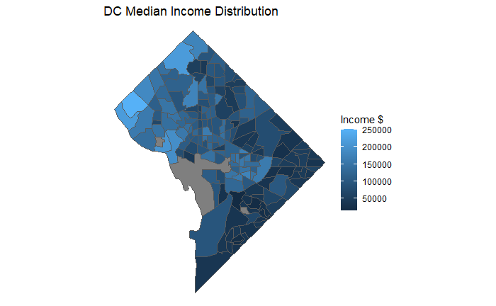
12.3 Do the same for two different states and cities.
la_income <- get_acs(
  geography = "tract",
  variables = "B19013_001E",
  state = 6,
  county = 37,
  geometry = TRUE,
  output = "wide",
  year = 2019,
  progress = FALSE)

la_income %>%
  ggplot() +
  geom_sf(aes(fill = B19013_001E)) +
  theme_void() +
  labs(title = "LA Median Income Distribution", fill="Income $")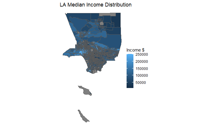
balt_income <- get_acs(
  geography = "tract",
  variables = "B19013_001E",
  state = 24,
  county = 510,
  geometry = TRUE,
  output = "wide",
  year = 2019,
  progress = FALSE)

balt_income %>%
  ggplot() +
  geom_sf(aes(fill = B19013_001E)) +
  theme_void() +
  labs(title = "Baltimore Median Income Distribution", fill="Income $")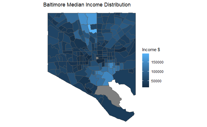
12.4 Now visualize income across the entire county at the state level. Include shift_geo = TRUE as an argument
us_income <- get_acs(
  geography = "state",
  variables = "B19013_001",
  geometry = TRUE,
  output = "wide",
  year = 2019,
  shift_geo = TRUE,
  progress = FALSE)

us_income %>%
  ggplot() +
  geom_sf(aes(fill = B19013_001E)) +
  theme_void() +
  labs(title = "US Median Income Distribution", fill="Income $")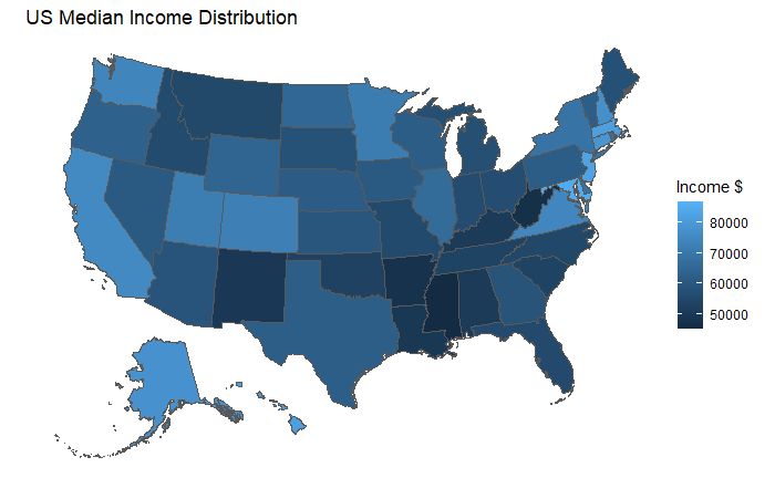
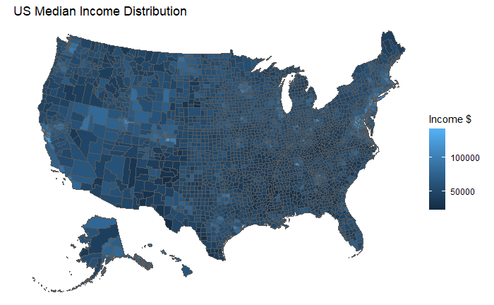
12.5 Do the same at the county level
us_income_county <- get_acs(
  geography = "county",
  variables = "B19013_001",
  geometry = TRUE,
  output = "wide",
  year = 2019,
  shift_geo = TRUE,
  progress = FALSE)

us_income_county %>%
  ggplot() +
  geom_sf(aes(fill = B19013_001E)) +
  theme_void() +
  labs(title = "US Median Income Distribution", fill="Income $")