4 Lab III: Univariate Visualizations
## Packages
library(tidyverse)
library(ggthemes)

## Data Loading
## Replace this with your working directory
load("~/GOVT8001/Lab 3/white_minwage.RData")
This lab shows step-by-step how to build basic histograms and barplots with library(ggplot2)
4.1 Histograms with library(ggplot2)
Histograms are good to visualize the distribution of one continuous variable.
4.1.2 Step Two
- Pipe the tibble into ggplot()
- Specify the variable of interest with
ggplot(aes(x = X))
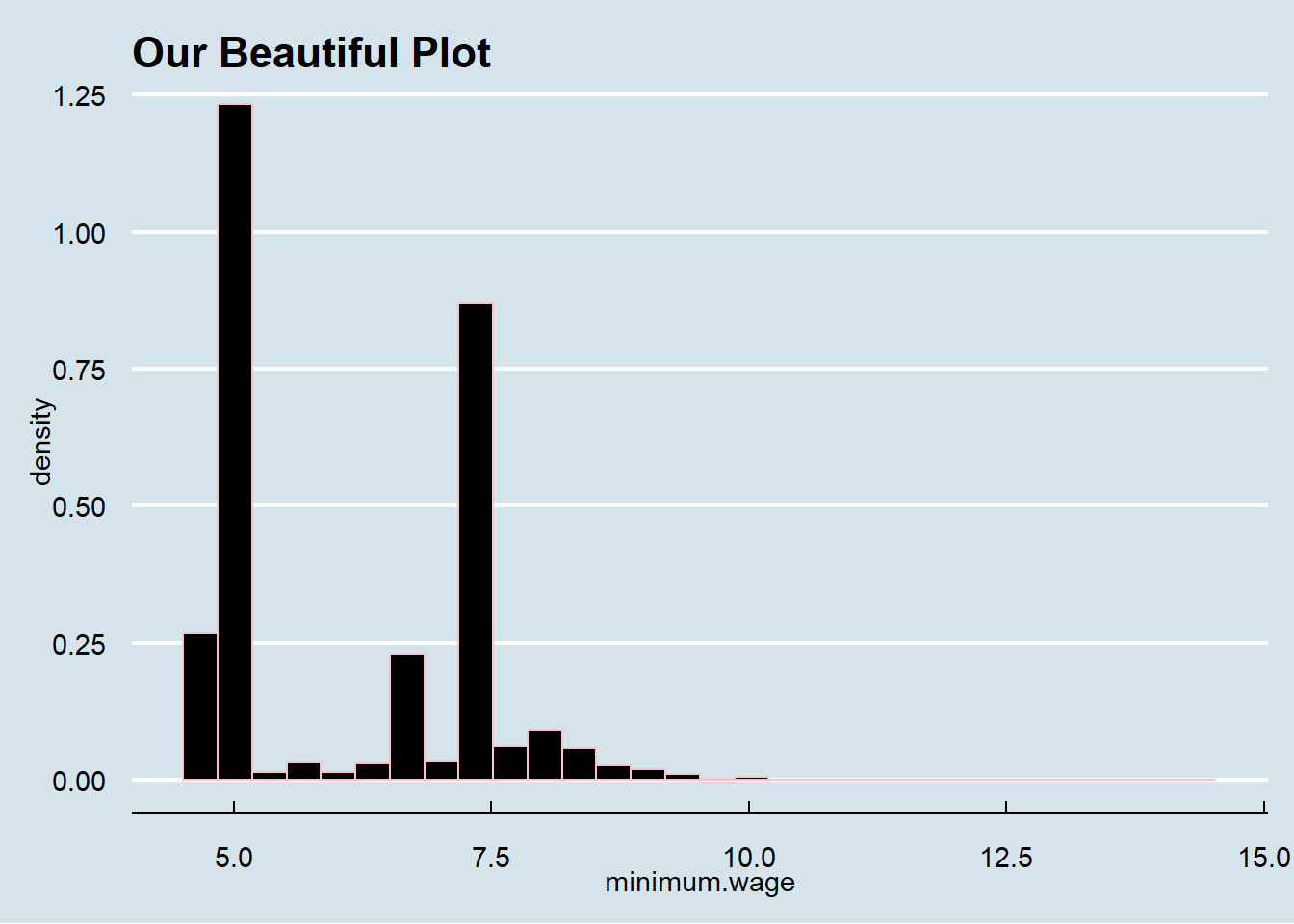
## Building A Basic Histogram
df.county %>%
ggplot(aes(x = minimum.wage))
4.1.3 Step 3
- Use
+instead of%>%to move to next line inggplot() geom_histogram()creates the histogram
## Building A Basic Histogram
df.county %>%
ggplot(aes(x = minimum.wage)) +
geom_histogram(aes(y = ..density..))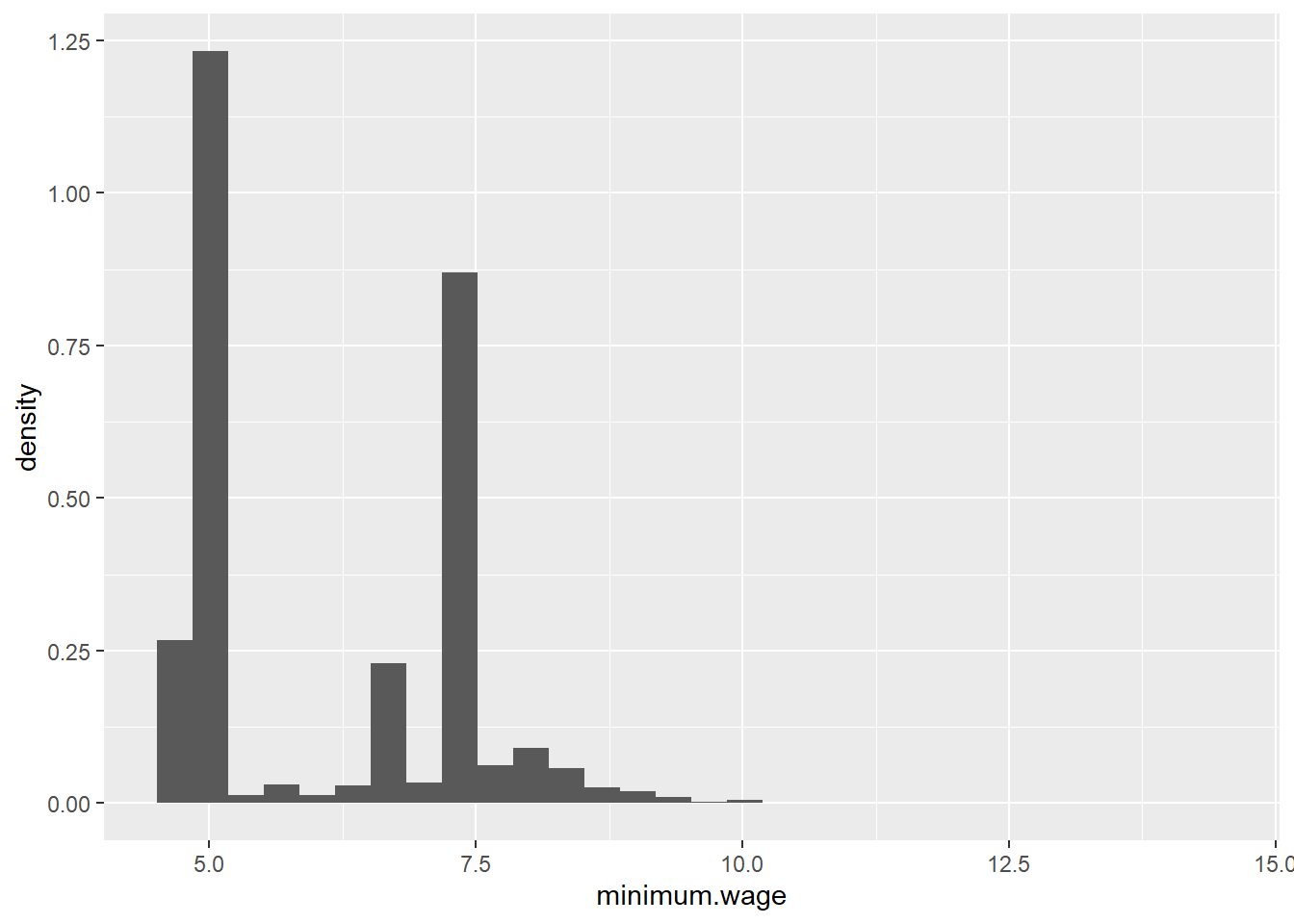
4.1.4 Step 4
- Customization of theme, colors, and labels.
- You can also save the object above and customize it later as shown below
- Use
col =andfill =ingeom_histogram()to set colors
- Use
## Building A Basic Histogram
df.county %>%
  ggplot(aes(x = minimum.wage)) +
  geom_histogram(aes(y = ..density..), col = "dark red", fill = "tomato")
- Use
+ theme()to set the themelibrary(ggtheme)has themes from your favorite publications!
## Building A Basic Histogram
df.county %>%
  ggplot(aes(x = minimum.wage)) +
  geom_histogram(aes(y = ..density..), col = "dark red", fill = "tomato") +
  theme_minimal()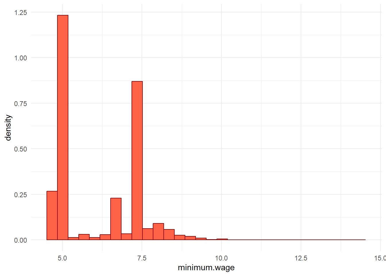
- Use
+ labsto set labelstitle =for a titlesubtitle =for a subtitlex =for x axis label andy =for y axis labelcaption =for caption to include data source or note
## Building A Basic Histogram
df.county %>%
  ggplot(aes(x = minimum.wage)) +
  geom_histogram(aes(y = ..density..), col = "dark red", fill = "tomato") +
  theme_minimal() +
  labs(title = "Distribution of Minimum Wage", subtitle = "All US Counties 1996 - 2016",
       x = "Minimum Wage", caption = "Data Source: Markovich & White (2022)",
       y = "Density")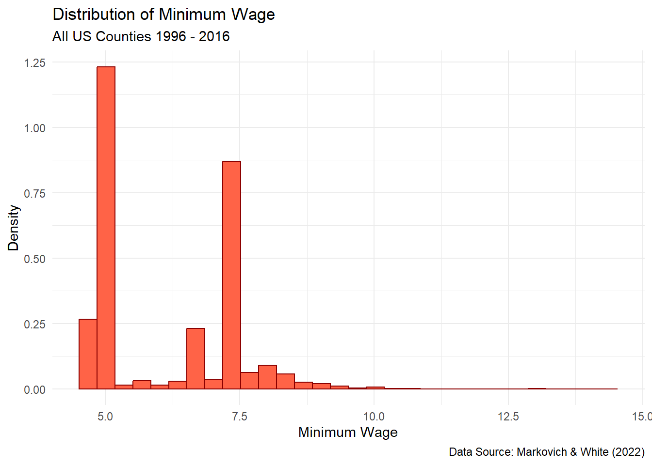
## Or You Can Save the Basic Plot and Experiment

p <- df.county %>%
  ggplot(aes(x = minimum.wage)) +
  geom_histogram(aes(y = ..density..), col = "dark red", fill = "tomato")
p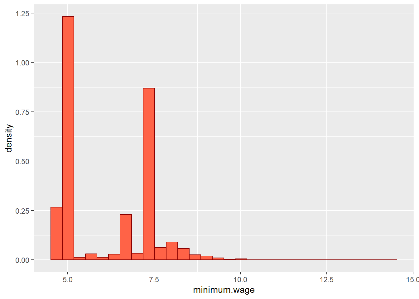
p +
  theme_minimal() +
  labs(title = "Distribution of Minimum Wage", subtitle = "All US Counties 1996 - 2016",
       x = "Minimum Wage", caption = "Data Source: Markovich & White (2022)",
       y = "Density")
4.2 Barplots with library(ggplot2)
Barplots are good for visualizing distributions by groups. The steps here follow closely what we did for the histogram.
4.2.1 Step One
- We will be using simulated data for this example.
- First we need to format our simulated data into something we can use for the barplot with the skills we learned last week.
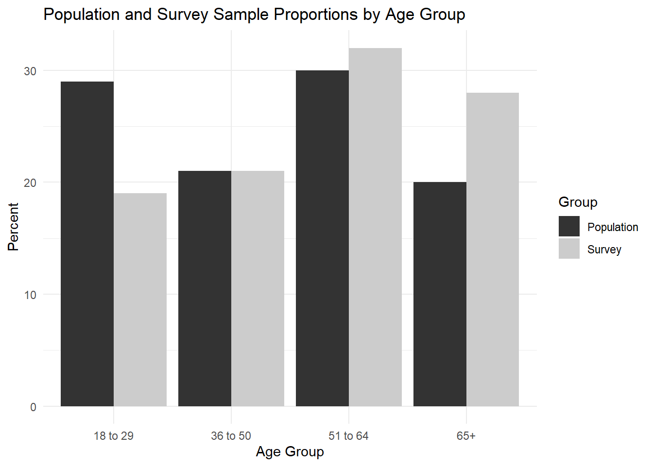
## Simulated Data
df <- data.frame("age" = c("18 to 29", "36 to 50", "51 to 64", "65+"),
                "popPct" = c(29, 21, 30, 20),
                "svyPct" = c(19, 21, 32, 28))
df
## age popPct svyPct
## 1 18 to 29 29 19
## 2 36 to 50 21 21
## 3 51 to 64 30 32
## 4 65+ 20 28## Building A Basic Barplot
df %>%
rename(Population = popPct, Survey = svyPct) %>%
pivot_longer(-age, names_to = "Group", values_to = "Percent")## # A tibble: 8 × 3
## age Group Percent
## <chr> <chr> <dbl>
## 1 18 to 29 Population 29
## 2 18 to 29 Survey 19
## 3 36 to 50 Population 21
## 4 36 to 50 Survey 21
## 5 51 to 64 Population 30
## 6 51 to 64 Survey 32
## 7 65+ Population 20
## 8 65+ Survey 284.2.2 Step Two
- Pipe the tibble into ggplot()
- Specify the variable of interest with
ggplot(aes(x = X)) - Since we want to show the distribution of X by some group, we can use
fill =to specify the group
## Building A Basic Barplot
df %>%
  rename(Population = popPct, Survey = svyPct) %>%
pivot_longer(-age, names_to = "Group", values_to = "Percent") %>%
ggplot(aes(x = age, y = Percent, fill = Group))
4.2.3 Step 3
- Use
+instead of%>%to move to next line inggplot() geom_bar()creates a barplot
## Building A Basic Barplot
df %>%
  rename(Population = popPct, Survey = svyPct) %>%
  pivot_longer(-age, names_to = "Group", values_to = "Percent") %>%
ggplot(aes(x = age, y = Percent, fill = Group)) +
geom_bar(stat = "identity", position = "dodge")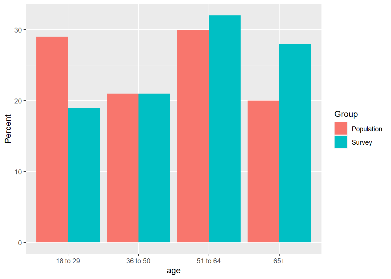
4.2.4 Step 4
- Now, we can customize just like above with the histogram.
scale_fill_grey()changes the color palette to greyscale
## Building A Basic Barplot
df %>%
  rename(Population = popPct, Survey = svyPct) %>%
  pivot_longer(-age, names_to = "Group", values_to = "Percent") %>%
  ggplot(aes(x = age, y = Percent, fill = Group)) +
geom_bar(stat = "identity", position = "dodge") +
scale_fill_grey() +
theme_minimal() +
labs(x = "Age Group", y = "Percent",
title = "Population and Survey Sample Proportions by Age Group")